Who is this ISBN guy?
So, no, this isn’t a post about International Standard Book Numbers (although that is a fascinating topic for a future post) and, no, this isn’t even really directly about the book we are featuring.
But since the back cover of this book provides one of two featured quotes in my Book Cover Project, and the front cover features on my “book wall” pictured at the start of the project, it seemed to make sense to give the book its due as a case study for that same project.
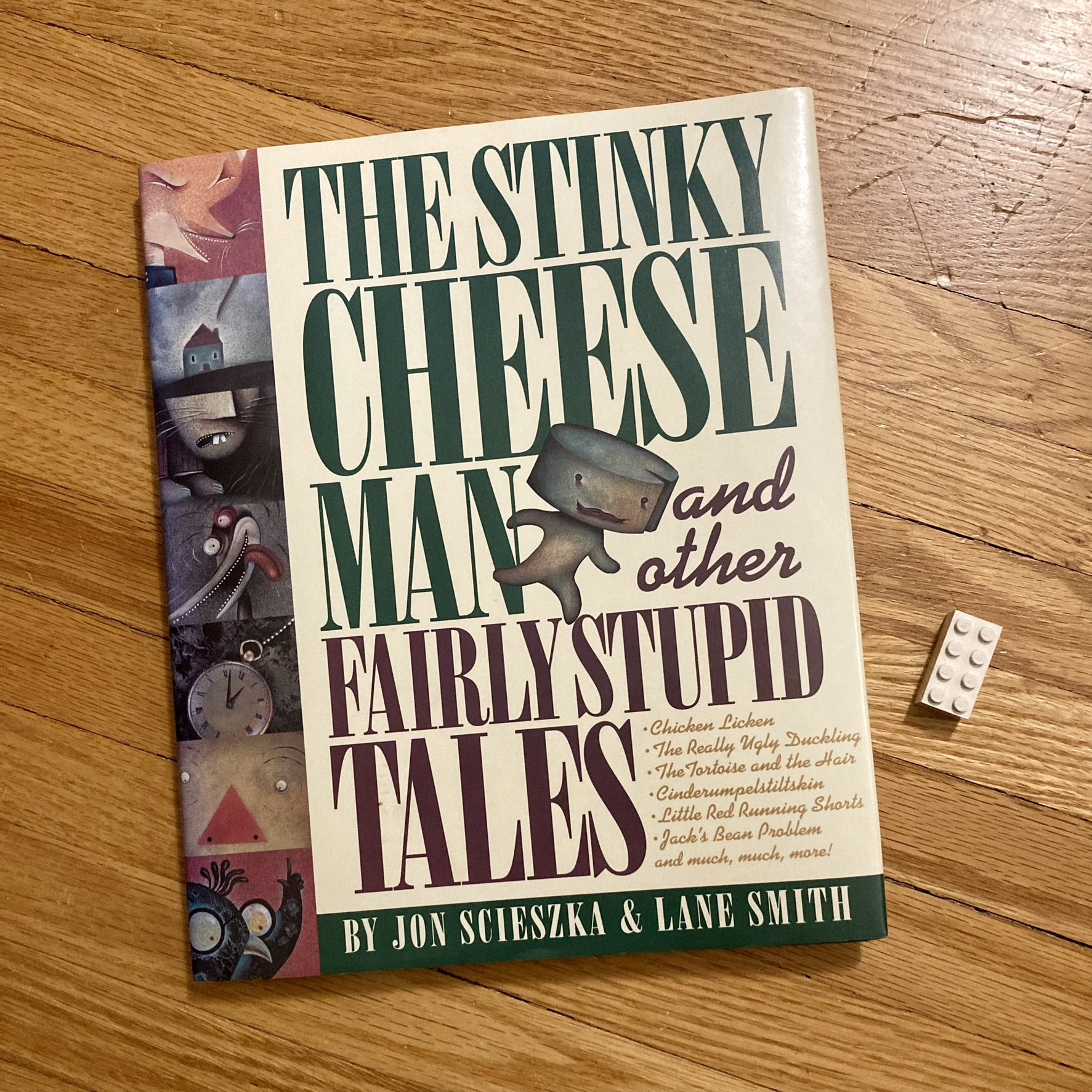
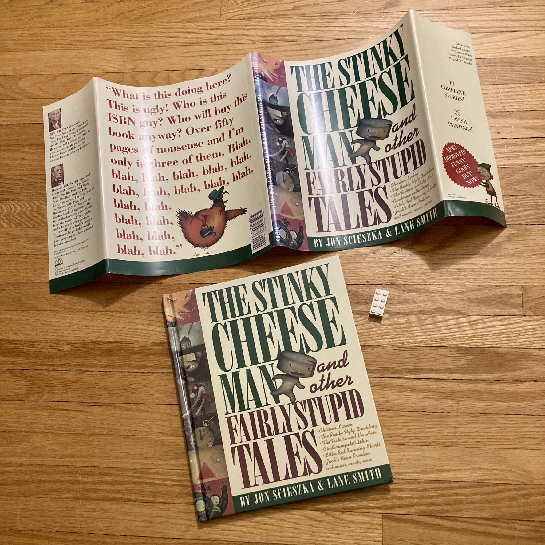
Therefore allow me the pleasure of introducing to you The Stinky Cheese Man and Other Fairly Stupid Tales, written by Jon Scieszka, illustrated by Lane Smith, designed by Molly Leach, and published by Viking in 1992.
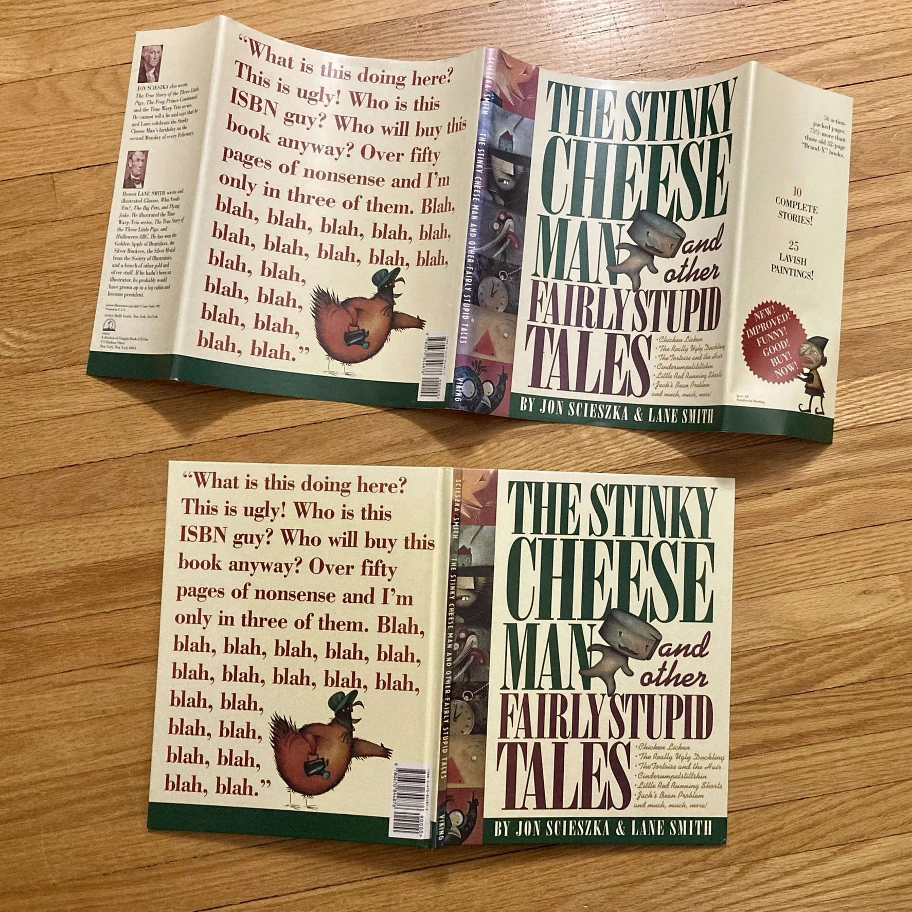
Unlike the other example illustrated book in the project, Oh No! (Or How My Science Project Destroyed the World), and its layers of cover artwork, The Stinky Cheese Man features the same artwork replicated on both the dust jacket and the cover boards, and no additional artwork on the back of the dust jacket.
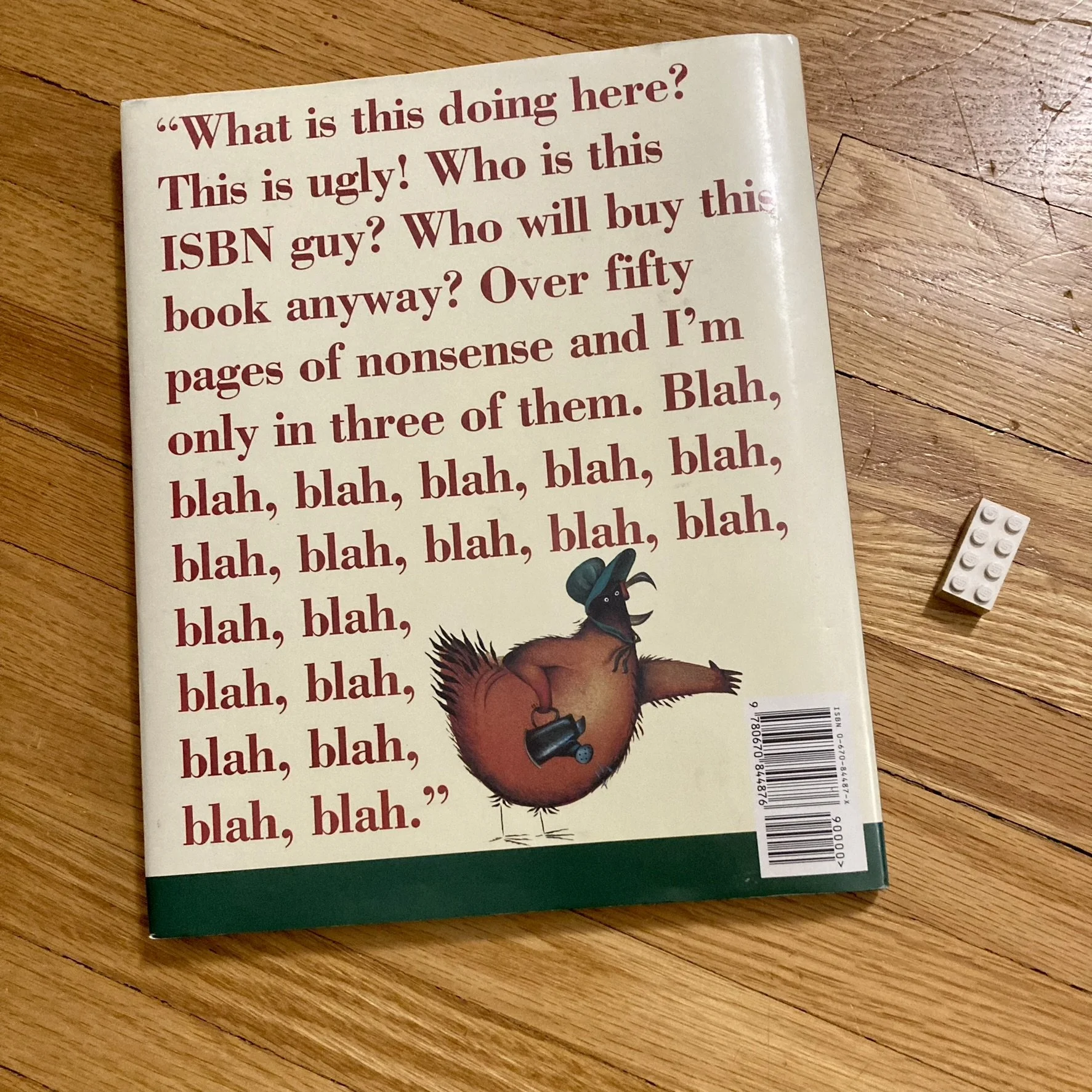
It is notable for a back cover that definitely serves the goal of drawing a reader in… and helped spark the establishment of the “Books Aware of Their Own Bookishness” collection here at Butterflies & Aliens North, alongside the classic The Monster at the End of This Book.
While the illustrator in Oh No! also incorporated the ISBN into their cover art, here it’s not only incorporated, it’s literally being called out. By a chicken. And now I, as a reader, have to see what’s going on on the inside of this book.
And the inside of the book is fascinating… but that’s not what this post is about…
Opening up the book and removing the dust jacket reveals…
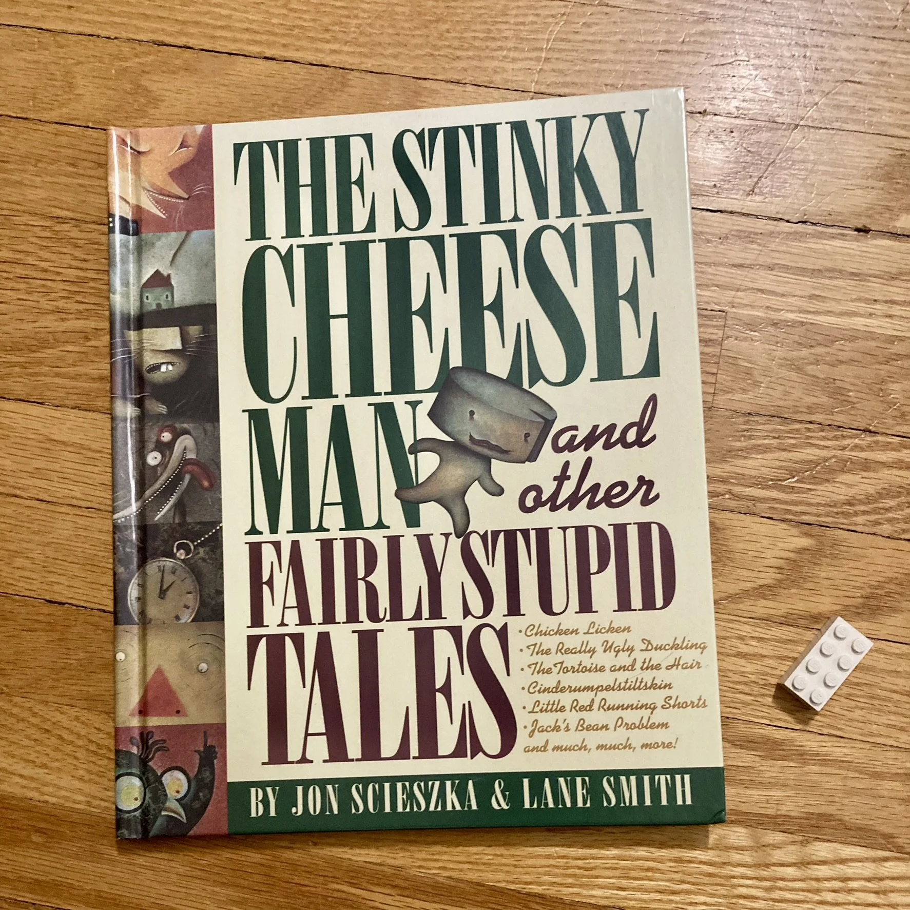
…the exact same cover art replicated on the cover boards attached to the book…
…on the front and the back.
But even without all the layers of Oh No!, there is nonetheless something extra on the dust jacket that would be lost if the dust jacket were removed or lost.
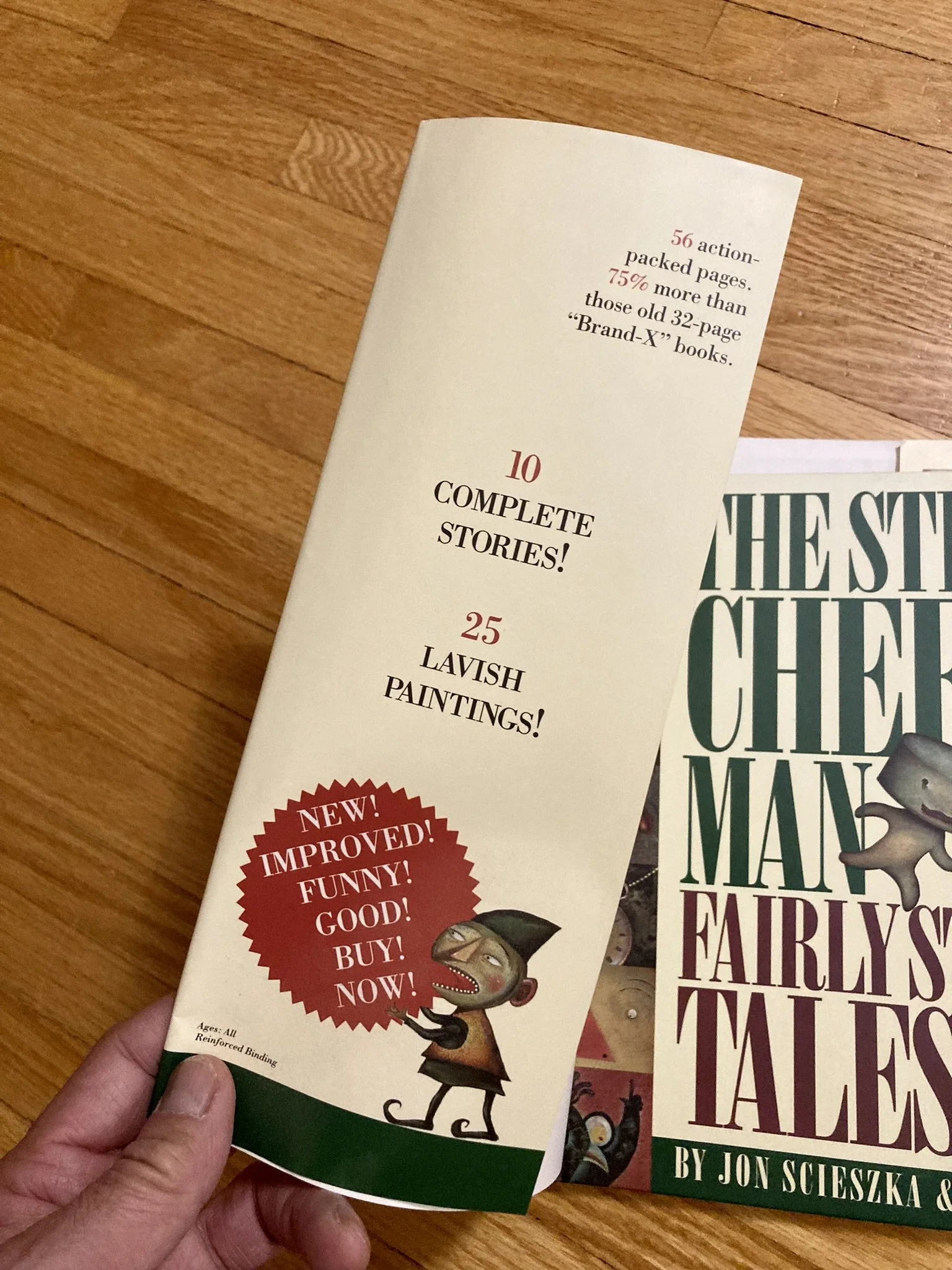
Playing off of language found on the front and back covers, the front inside flap is basically a satire of the kinds of marketing messages found on other dust jacket flaps:
“56 action-packed pages”
“75% more than those old 32-page ‘Brand-X’ books”
“10 COMPLETE STORIES!”
“25 LAVISH PAINTINGS!”
“NEW!
IMPROVED!
FUNNY!
GOOD!
BUY!
NOW!”
Even the tiny “Ages: All” and “Reinforced Binding” help set a tone and intention.
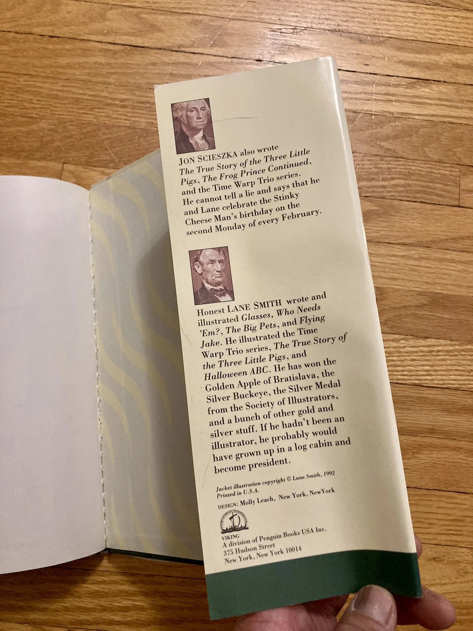
Meanwhile on the back cover flap, we get a similarly non-standard-but-standard author and illustrator bio written, in keeping with the rest of the book, fairly tongue in cheek. But it is nonetheless where we do learn some truth about the track record for both author and illustrator, which is not found anywhere else in the book.
And the content of these flaps, even though technically not attached to the book, are very much a part of the whole package of the book and a valuable part of the “story” or “text” being delivered by and between the covers.
This is where I now shout out again Benita Strnad and Ginger Magnusson Hewitt’s 2021 article “Reading a Book Through Its Cover: The Importance of Preserving Visual and Tactile Information in Children’s and Young Adult Literature in the Academic Library” in which they make a strong case for academic libraries to preserve things like dust jackets along with the core book.
Sure, on the surface, this…
…doesn’t look much different than this…
…but once that cover draws you in and you open up the book, there’s a difference in your experience with every extra touch.
And often… in books and music and other art… it’s the little extra touches that complete the work.
Happy Reading!
– Winston


