

Star Wars: A New Approach
In 2015, no doubt propelled by the-marketing-machine-that-is-Disney acquiring Lucasfilm three years prior, three “original retellings” of the original three Star Wars movies arrived in bookstores and libraries in hardcover format, followed by paperback editions in 2019.
And as candidates for our Head Alien’s Book Cover Project, the covers of these paperback editions jumped out from the shelves.
Designed by Pamela Palacio and Jason Wojtowicz, with distinctive silhouette illustrations by Khoa Ho, all three covers are clearly meant to go together, yet also stand out on their own. And with the bold colours and shapes, emphasizing the “master brand” Star Wars name along with character silhouettes instantly recognizable to fans, the books stand alone and as a set, reinforcing one another to create that much more noticeable a presence on the shelves.
Palacio and Wojtowicz use both white and black lettering, in different sizes against the bold solid colour backgrounds, to great effect. The bold black “Star Wars” combined with the black images – not just silhouettes but smaller reverse silhouettes playing out a scene against the larger dark silhouettes – focus our attention right to the center of the book and the solid Star Wars hook.
But then the designers chose to run the original name of each movie in small black letters, more bridge than destination for the eye, leading instead to the bigger – but not too big – setting of the “retelling” title in thin white type. And visually balanced at the top we find the author’s name in thin black type, with the smallest font, in white, announcing all three authors as New York Times best-selling authors.
The Princess, The Scoundrel, and the Farm Boy is the new title for Star Wars: A New Hope.
So You Want To Be A Jedi? is the new title for Star Wars: The Empire Strikes Back.

And Beware the Power of the Dark Side! is the retelling of Star Wars: Return of the Jedi.

Aimed at a younger audience, readers aged 9-12, these covers have clearly been designed with that in mind. That is likely one reason why the “New York Times best-selling author” text on all three books is the smallest thing on the cover, of little interest to a 10-year-old but perhaps needed for the parent wondering who the heck this is rewriting the mythology of their youth.
But at the same time I wouldn’t describe the design as childish or cartoony. While simple, the design feels more mature, perhaps because of that simplicity.
That simplicity and boldness also extends to the spine of all three volumes, resulting in a noticeable presence even when shelved spine out.
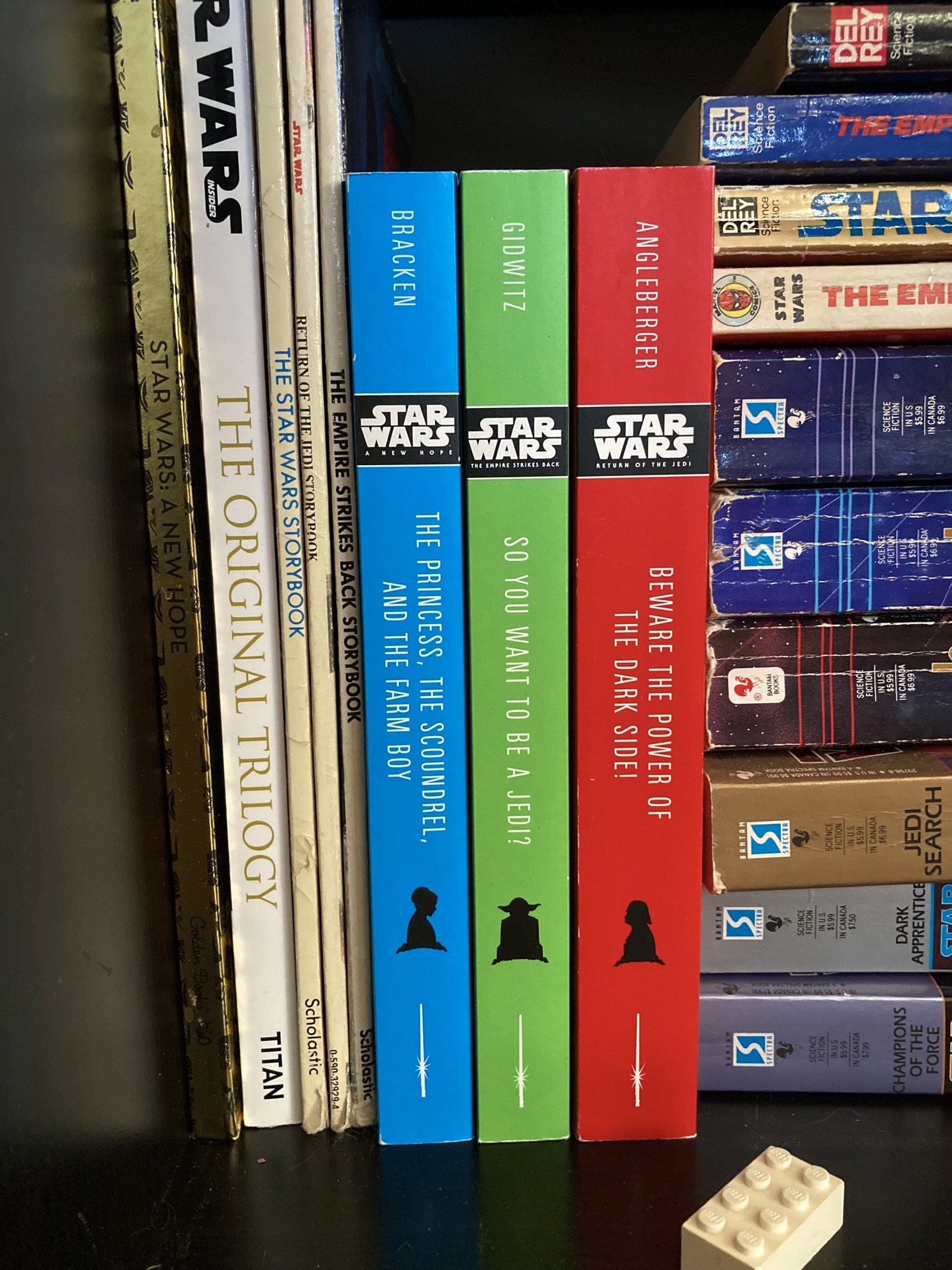
Once again, clearly a set but also individually distinct, and bold as a group.
My only criticism is not even a design one, but rather one of manufacture. The binding and trimming of the blue The Princess, The Scoundrel, and the Farm Boy is off by millimeters – two at most – resulting in unevenness that is really only bothersome because the designs are otherwise so complementary.
As another case study of cover design and how it plays a role in drawing attention to the books they protect and promote, this set demonstrates the power of working together.
Happy Reading!
– Winston