Foundations
Cover from the Del Rey / Ballantine Books edition of Foundation by Isaac Asimov, this copy being from the seventeenth printing, October 1987, with the distinctive and dare I say iconic cover artwork by Michael Whelan.
In celebration of a colleague receiving his mail ordered Folio Society editions, as well as the upcoming AppleTV adaptation, I thought I’d share a few images from my collection of Isaac Asimov’s Foundation series. Beginning with the original trilogy published in the early 1950s, the Foundation universe grew to include seven novels in the series and another eleven within the same fictional timeline, plus additional books by other authors set in the same universe.
This series and author were a huge part of my early induction into the worlds of science fiction, with the cover art by Micheal Whelan playing a big part in that attraction as well. The 1980s edition pictured above is how I was first introduced to Foundation.
This same artwork then finds its way onto other editions, such as this hardcover omnibus edition from 2012.
Cover of the 2012 Bantam Spectra edition of The Foundation Trilogy.
The copyright page from this edition also speaks to the books’ long publication history.
Detail from the copyright page of the 2012 Bantam Spectra edition of The Foundation Trilogy.
As I’ve continued to collect different copies of my favourites works, and been fascinated by the nuances of the different “performances” of them, the different styles of cover art have been a particular focus of my curiosity. To see the different interpretations of the written work into visual art adds a whole other level of appreciation to the overall book.
The cover of the 1966 Avon edition of Foundation.
This 1960s cover sets an entirely different mood and state of mind from which to approach the written work within, but fits just as well as the more realistic Whelan painting from the 1980s.
And like the Whelan image, this style too comes back in future editions, adapted and remixed.
Cover of the November 1974 Avon omnibus edition of The Foundation Trilogy, seventh printing.
This 1983 Del Rey / Ballantine Books edition takes yet another approach to summing up three whole novels in a single image, this time with artwork by Don Dixon.
Cover of the 1983 Del Rey / Ballantine Books omnibus edition of The Foundation Trilogy.
But yet again, the image fits, providing an apt complement to the writing, albeit again completely different from the two earlier examples.
The evolution of the covers, if that’s even the right term, says more about the book buying audience over time than the books themselves, the manuscript within being unchanged throughout.
I’ve never really subscribed to the idea that you shouldn’t judge a book by its cover. That is often your first impression of the book, and it can set you up for pleasure or disappointment, not so much based on the quality of the image alone but more from how much the cover aligns with and complements the story within.
It very much contributes to the performance overall.
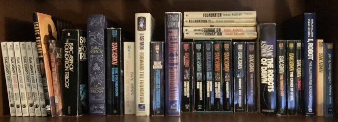
And the result of this fascination is, among other things, this…
The Robots/Empire/Foundation shelf at Butterflies & Aliens North, being but a portion of the Asimov collection gathered therein.
As I await the coming AppleTV series with a mix of anticipation and dread – and I am one who subscribes to the idea that the adaptation is never as good as the book – I am taking the opportunity and excuse to revisit my universe of print editions.
And while I’m at it, also a chance to focus on just the covers a bit, pulling out this lovely volume to flip through as well…
The cover for Micheal Whelan’s Works of Wonder, published by Del Rey / Ballantine Books in December 1987, with foreword by Isaac Asimov, and featuring the artwork from the cover of Asimov’s The Robots of Dawn.
Happy Reading and Happy Art Appreciating!
– Winston


